Brissie Realty is a Portfolio Project. The brief is to create a brand that can stand out in a crowded western Brisbane market by threading that balance of an Agency that is ‘more approachable’ without losing their sense of professionalism.
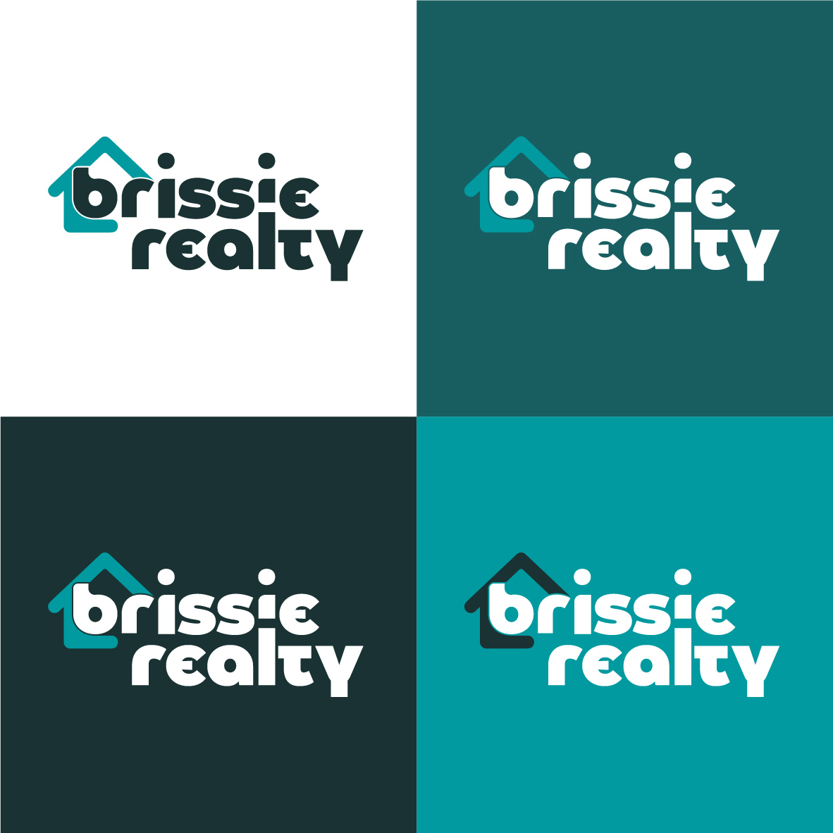
Logo & Branding
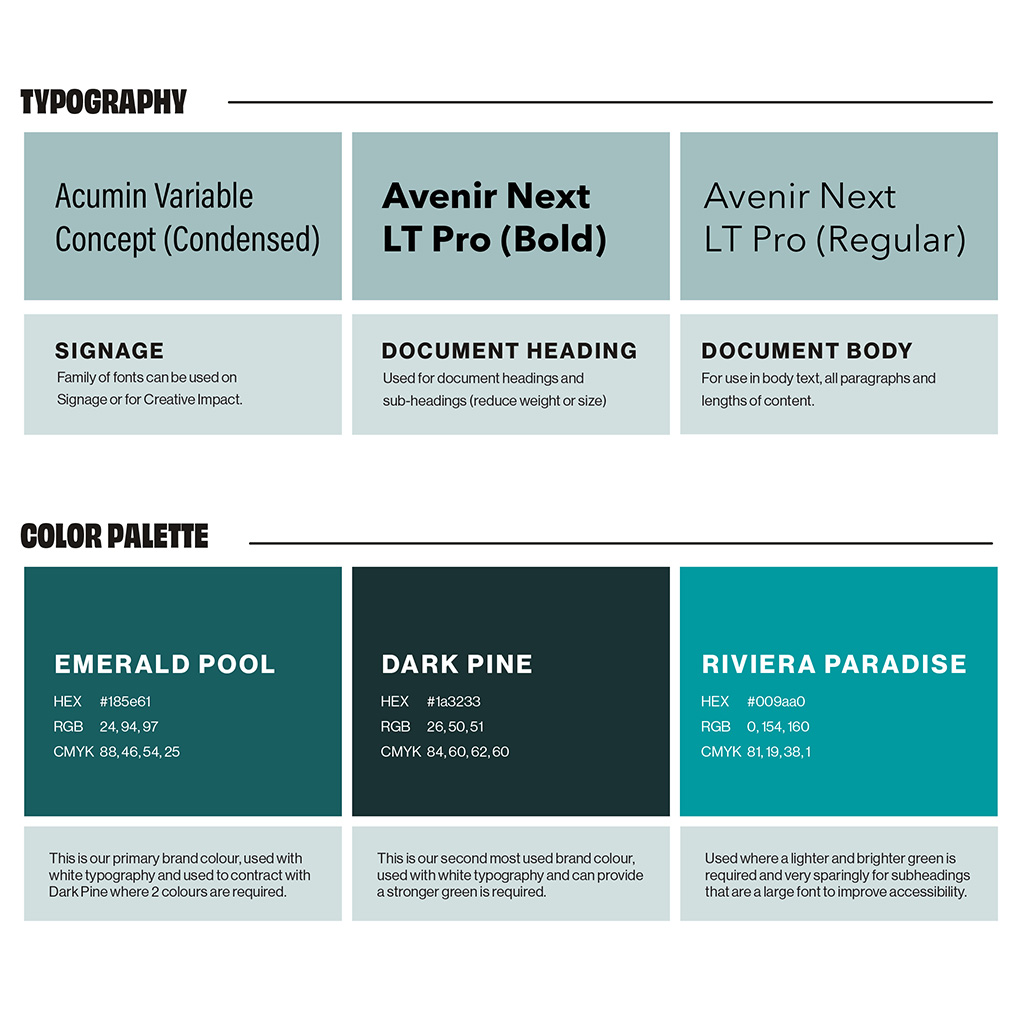
Colour: The existing market uses predominately yellows, red and blues, so in order to differentiate ourselves, we have gone for a series of complementary greens.
Typography: Acumin Variable Concept used in Signage has a range of versatile variations (condensed, semi-condensed etc) to cater for any situation that comes up.
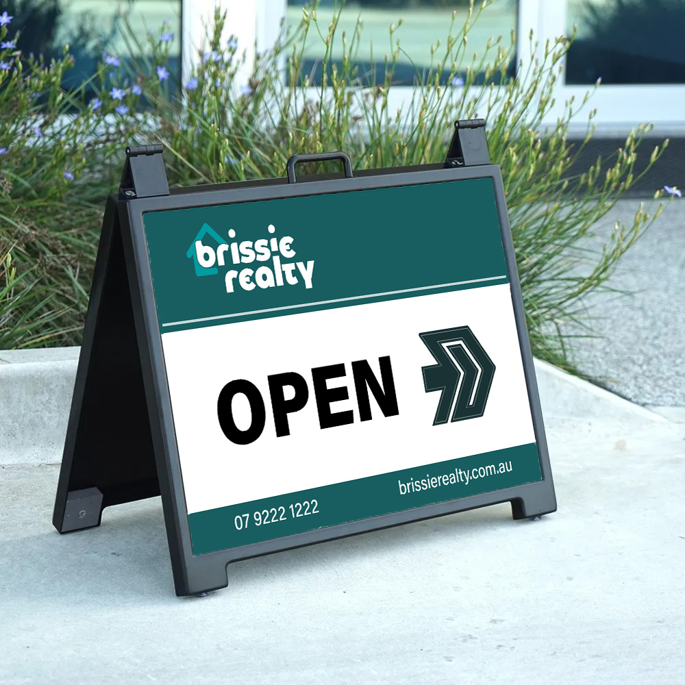
Signage
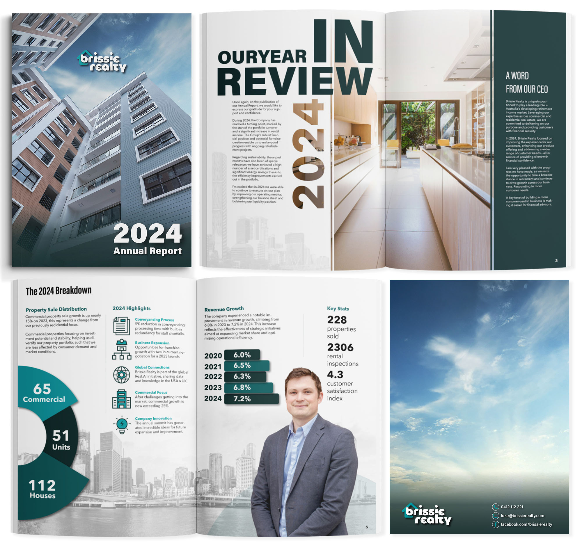
Annual Report (2024)
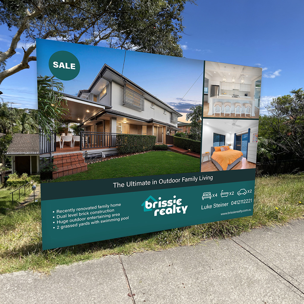
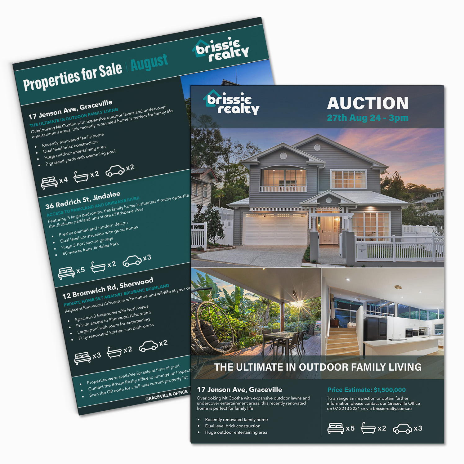
A4 Flyers
A4 Flyers used for Brisbane Realty, the top flyer is a feature house for an upcoming auction, while the bottom page is used for sharing monthly property sales (digitally & in branch).